Bonnie at Pixel Dust Photo Art issued a real creative challenge this week for PAF (photo art Friday) - your image should have "something hidden", something not readily apparent when you look at it. Hmmmm. Even with her examples, it was a challenge and took plenty of trial and error on my part. Here's what I imagined:
Titled it: Journey
I tried to have increasingly subtle layers of visibility, hinting at what's underneath...... I added the circles at various opacities to mimic the one on the map which is circling Kokomo, IN, my husband's home town.
SPOILER ALERT: The following image shows all the layers I used in my composite, so look at it first and see if you can discern the "something hidden in plain sight" before looking at the next image. Let me know in the comments if you guessed right.
Original images used:
So, here's my work order:
In PSE7 map is first layer, duplicated at hard light 55%, next is the circles, then the water at multiply 90%, the rainbow at vivid light 65% (and dark trees erased), duck at normal, and finally trees at hard light 87%. Hope you like the results. Visit other photographers and see what they've hidden by visiting Bonnie's site.
3/8/12
3/6/12
woyww #9
This week for WOYWW I have some progress from things started last week.
You may remember I'd gessoed (?) over a canvas I didn't like and was going to go a different direction....direction started:
Liking the layers of red and orange and texture...not sure where next. Also started a little box 'canvas' covered with music (it's actually the box my soap comes in).
Then, I was working on trying to make my own decorative tape using masking tape. (I used it in my lettering journal which I'll share later in the week) I made some more and found that using the expensive stuff from Home Depot didn't work as well as the $1 store stuff. HD was too sticky and wouldn't peel off the freezer paper - it might work better on waxed paper but I don't have any right now. Plus the dollar store tape is whiter - here are some new experimental strips:
I found that acrylic paints and Inktense watercolor pencils work well, oil pastels (the green/yellow stripe) don't blend or smoosh at all, rubber stamps work great! I'm playing with my new alpha stamp set.
I found my projects overflowing my work table this week (I'm sure that never happens to any of you) so behind me on the ironing board (great table height :)) I have my AB (altered book) project waiting to get going and some great tissue paper pieces I'll be adding to a collage (project from Jane Davies Collage Journeys book).
The tissue paper project is to choose 2 colors of paper and sandwich something in between, sealing the papers together with matte medium.
The top one I stamped with a lady bug on yellow and glued it to a light blue tissue paper; on the right I drew spirals with oil pastels and used yellow and lime green tissues; on the bottom I used yellow and white and sandwiched cut out leaf shapes. Using the 2 layers of tissue paper gives the paper more substance and the two colors blend to form a nice third color with a stronger tint depending on which side you place up. An easy and fun project - thanks Jane!
Lots of other desks to explore over at Julia's Stamping Ground.....
You may remember I'd gessoed (?) over a canvas I didn't like and was going to go a different direction....direction started:
Liking the layers of red and orange and texture...not sure where next. Also started a little box 'canvas' covered with music (it's actually the box my soap comes in).
Then, I was working on trying to make my own decorative tape using masking tape. (I used it in my lettering journal which I'll share later in the week) I made some more and found that using the expensive stuff from Home Depot didn't work as well as the $1 store stuff. HD was too sticky and wouldn't peel off the freezer paper - it might work better on waxed paper but I don't have any right now. Plus the dollar store tape is whiter - here are some new experimental strips:
I found that acrylic paints and Inktense watercolor pencils work well, oil pastels (the green/yellow stripe) don't blend or smoosh at all, rubber stamps work great! I'm playing with my new alpha stamp set.
I found my projects overflowing my work table this week (I'm sure that never happens to any of you) so behind me on the ironing board (great table height :)) I have my AB (altered book) project waiting to get going and some great tissue paper pieces I'll be adding to a collage (project from Jane Davies Collage Journeys book).
The tissue paper project is to choose 2 colors of paper and sandwich something in between, sealing the papers together with matte medium.
The top one I stamped with a lady bug on yellow and glued it to a light blue tissue paper; on the right I drew spirals with oil pastels and used yellow and lime green tissues; on the bottom I used yellow and white and sandwiched cut out leaf shapes. Using the 2 layers of tissue paper gives the paper more substance and the two colors blend to form a nice third color with a stronger tint depending on which side you place up. An easy and fun project - thanks Jane!
Lots of other desks to explore over at Julia's Stamping Ground.....
3/5/12
altered book: step 1
I'm so excited to be following along with Elizabeth's altered book class - it's free and she is sharing the most detailed instructions imaginable. If this is something you've wanted to try, now's the time. She's moving at a slow and steady pace to give us all time to get the materials and prepare them, step by step - we're only on lesson 2, so there's still time to join in.
Here's my step 1 - obtain a book with a STITCHED binding, remove some pages (about 1/3).
Not too exciting photos yet, but just wait.... :) The rubber banded section will become a niche to hold a little treasure - mine's going to have to be pretty narrow; I didn't reserve many pages. Today's lesson came out and covers making the niche and preparing the cover and inside pages. I can't wait to get started....
Oh yeah, we were also supposed to decide on a theme and start collecting paper/photos, etc. to go in the book. My theme is Daydreams.
This and all my other posts this week are shared with Creative Every Day where Leah encourages and reminds us to create something every day, whether it's cooking, writing or painting. Stretch those creative muscles! Leave your link so we can see how you're being creative.
Here's my step 1 - obtain a book with a STITCHED binding, remove some pages (about 1/3).
Not too exciting photos yet, but just wait.... :) The rubber banded section will become a niche to hold a little treasure - mine's going to have to be pretty narrow; I didn't reserve many pages. Today's lesson came out and covers making the niche and preparing the cover and inside pages. I can't wait to get started....
Oh yeah, we were also supposed to decide on a theme and start collecting paper/photos, etc. to go in the book. My theme is Daydreams.
This and all my other posts this week are shared with Creative Every Day where Leah encourages and reminds us to create something every day, whether it's cooking, writing or painting. Stretch those creative muscles! Leave your link so we can see how you're being creative.
texture tuesday: happy heart
I loved this theme and this texture. Kim at Kim Klassen Cafe offered a simple challenge this week - use her free texture Happy Hearts somewhere.
As I was thinking of what photo to play with this week, I realized that with a texture named Happy Hearts, the photo had to include my husband......since he makes my heart absolutely happy.
Original image (we were going out):
I used Happy Hearts at soft light 70%, duplicated it and used it at multiply 45%. Somehow it seems they should cancel each other out...one lightens, one darkens, but without both, the photo was either too washed out or too dark. Then I added Kim's Pink which put some texture on the blank wall. I erased around our faces a bit at reduced opacity to remove most but not all of the textures.
There are lots of talented participants on Texture Tuesday - check 'em out.
As I was thinking of what photo to play with this week, I realized that with a texture named Happy Hearts, the photo had to include my husband......since he makes my heart absolutely happy.
Original image (we were going out):
I used Happy Hearts at soft light 70%, duplicated it and used it at multiply 45%. Somehow it seems they should cancel each other out...one lightens, one darkens, but without both, the photo was either too washed out or too dark. Then I added Kim's Pink which put some texture on the blank wall. I erased around our faces a bit at reduced opacity to remove most but not all of the textures.
There are lots of talented participants on Texture Tuesday - check 'em out.
collage monday
Donna over at Simply Me shares her journal pages and collages and today threw out the challenge to create a collage in monochromatic colors. It just so happens that this weekend I made my first "scrap" collage using up some of the bits and pieces of paper on my work table. And, it's pretty monochromatic. My double journal page from the weekend:
Okay, maybe not as monochromatic as I thought (Donna's was much more green...though you could use any color) - I thought it was mostly green but I forgot that I laid down the watercolor background, which is mostly blue. Oh well - it's a lot of green :)
I used scrapbook papers, bits of my junk table protector paper (the spattered stems), a piece from an address book (the circle of floral), etc. It actually was a pretty fun exercise.
Okay, maybe not as monochromatic as I thought (Donna's was much more green...though you could use any color) - I thought it was mostly green but I forgot that I laid down the watercolor background, which is mostly blue. Oh well - it's a lot of green :)
I used scrapbook papers, bits of my junk table protector paper (the spattered stems), a piece from an address book (the circle of floral), etc. It actually was a pretty fun exercise.
abstract mixed media
I don't know if this piece is mixed media or collage, since I've painted over layers of book pages, but whatever it is, I think it's done (for now). It's inspired by Jane Davies, author of Collage Journeys, and her video about working large. My "large" is a 16x20 canvas, my color palette, white, black and a craft acrylic paint celery green or similar, and then a bit of veridian green for the teal highlights.
I started with some random marks and drips made with india ink. Then I added lots of torn book pages around the lines (forgot to take a picture of that stage).
I smooshed around the black and white making all those delicious grays. The bits of gold/orange are the book pages peeking through and the warmer spots of gray are with the celery green added.
I softened the darkest blacks in the upper right, covered more of the canvas and adjusted the lower right corner tones. I'm pleasantly surprised at how much I'm liking it.
I added some bubble wrap dots (large bubble wrap) and the teal. As I lived with it a day on the wall, I noticed that the design is clearly separated into quadrants and there's a "focal point" in each one. Not liking that - the eye doesn't know where to look. A revision is in order.
I redid the upper left corner, making it quieter, added another horizontal line at the bottom to strengthen the composition and keep the weight at the bottom. Now it's on the wall for a bit to make sure it's done. Here are a couple of detail shots:
I feel like I had a productive, successful weekend! I'm open to any and all comments/suggestions for improvement/observations, etc. What do you think of the composition? the tonal variety? the textures? how can I improve my efforts next time?
By the way, be sure to visit Jane's site - she is truly an inspiration and offers lots of online classes.
3/4/12
lettering love journal - four pages
Here are the first 4 pages of my lettering love journal - I showed the background pages a week or two ago and have been working on them kind of randomly. As with most things, I'm finding some pages are more successful than others and I still need practice judging how much space the words are going to take. Since this is only volume 1, I'll have plenty more opportunities to practice!
The cover - simple and easy.
Inside cover, bright and I chose words to set the tone for the rest of the pages. As suggested by Joanne I used decorative duck tape to bind the pages - it's the black/white on the right.
Pages 2 and 3 are narrower.....
Oooops - crooked tape below....
And page 4, facing the 'joy' page, is back to the standard width.
Here's an example where I started the letters too big necessitating a crunch adjustment at the end, making the word (reward) hard to read. Bummer. I actually liked the way 'reward' was going til it got all crowded!
I'll be back with more pages when they're done - maybe end of the week?
The cover - simple and easy.
Inside cover, bright and I chose words to set the tone for the rest of the pages. As suggested by Joanne I used decorative duck tape to bind the pages - it's the black/white on the right.
Pages 2 and 3 are narrower.....
Oooops - crooked tape below....
Here's an example where I started the letters too big necessitating a crunch adjustment at the end, making the word (reward) hard to read. Bummer. I actually liked the way 'reward' was going til it got all crowded!
I'll be back with more pages when they're done - maybe end of the week?
3/3/12
scavenger hunt
After missing a couple weeks, I'm back with Ashley's scavenger hunt Sunday. This week's 5 topics are:
Technology:
The technology of photo processing - where would I be without it? (from my archives, notice the hair color difference?)
Mismatch:
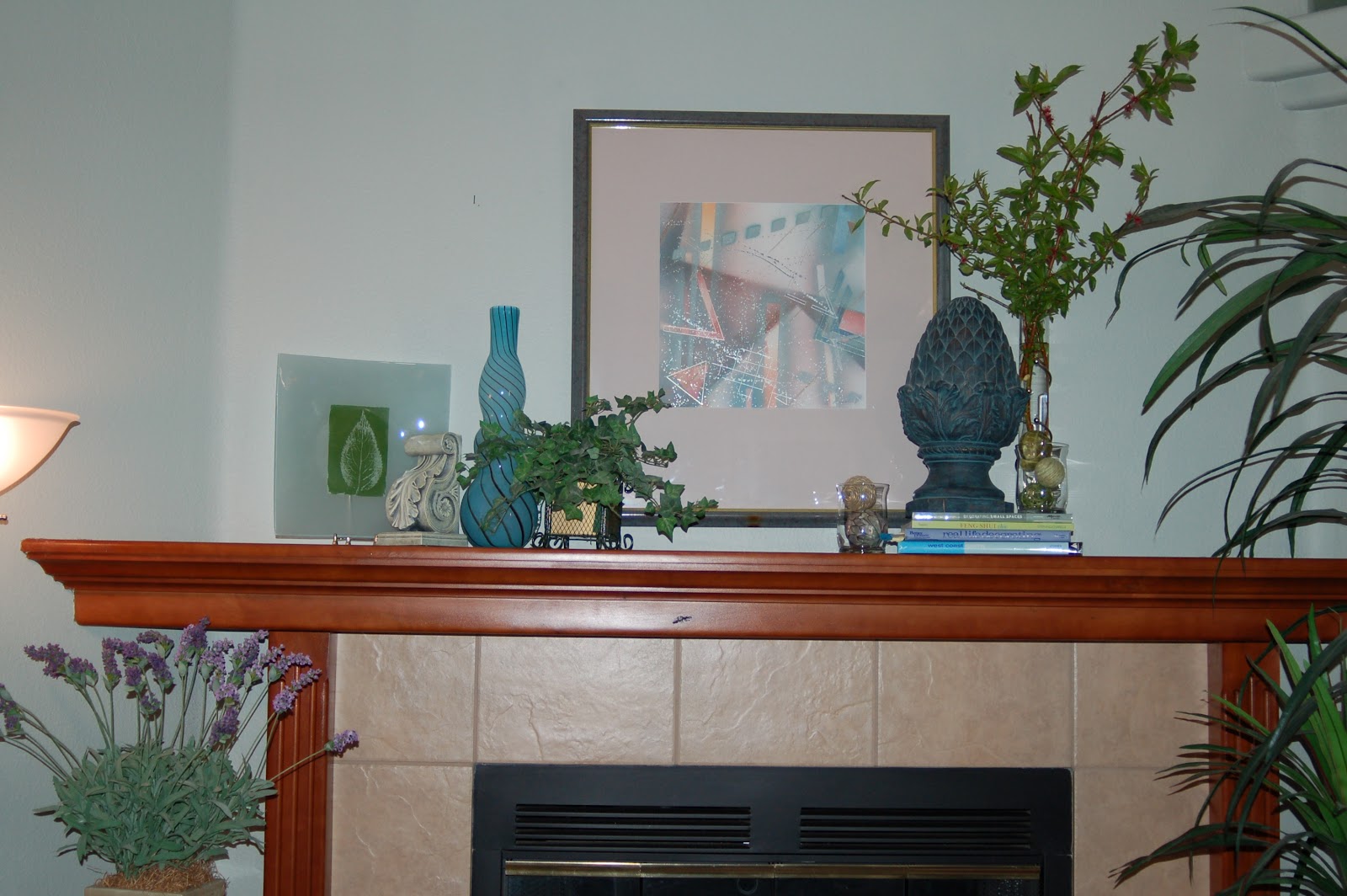
These photos could also have worked for showing my style I guess - which is all about the mismatch....my mantel decor is always filled with random, mismatched accessories gathered from around the house. Above I was playing around with several different ideas for a spring look - which do you think I kept?
Routine:
Not so unusual - my morning routine is oatmeal and a book. Always, a book.
Music:
I often use pieces of sheet music as a background beginning for a collage - I love to have it play hide and seek with whatever ends up on top. In this case, it was a collage for my mother-in-law who loves horses.
Show me Your Style:
Instead of showing my clothing style - boring and pretty conservative, no cool shoes or bags - I'll show my house style. This photo speaks volumes (pun intended :) about me. Filled withh my favorite books, travel and family mementos, it's a map of my life (and my style).
Be sure to visit Ashley's site to check out the multitude of links - there are always such creative interpretations of the topics.....
Technology:
The technology of photo processing - where would I be without it? (from my archives, notice the hair color difference?)
Mismatch:
These photos could also have worked for showing my style I guess - which is all about the mismatch....my mantel decor is always filled with random, mismatched accessories gathered from around the house. Above I was playing around with several different ideas for a spring look - which do you think I kept?
Routine:
Not so unusual - my morning routine is oatmeal and a book. Always, a book.
Music:
I often use pieces of sheet music as a background beginning for a collage - I love to have it play hide and seek with whatever ends up on top. In this case, it was a collage for my mother-in-law who loves horses.
Show me Your Style:
Instead of showing my clothing style - boring and pretty conservative, no cool shoes or bags - I'll show my house style. This photo speaks volumes (pun intended :) about me. Filled withh my favorite books, travel and family mementos, it's a map of my life (and my style).
Be sure to visit Ashley's site to check out the multitude of links - there are always such creative interpretations of the topics.....
3/1/12
paf: abstract
Since finding Bonnie's site Pixel Dust Photo Art, I've become SO much more daring and experimental in my digital art efforts. This week was to try something abstract or any type of photo art. I LOVE playing at abstract! A couple weeks ago Bonnie showed some results she got by using the wave filter in PSE so I tried it out on a couple different images. I found that if the image is TOO simple, the waves aren't that interesting. If the image is too busy, the waves are a jumbled mess. And, there are so many ways of adjusting the depth, frequency, etc of the wave that it was a bit overwhelming. So I clicked the randomize button and got this fabulous result.
Here are the 2 images of mine I used, no textures, just the PSE filter. Adding the water overlay added the brighter stripes of color which I thought improved the interest of colors. I just LOVE the striations of color. In fact, I'm inspired to paint.....don't you think are some great painting inspirations in this? I'll post my efforts on this soon!
This second effort, I took one of my sunflower photos and added Bonnie's texture heavenly at overlay 100% for the texture and depth of color and abstract splotches at hard light 37% which I then erased over the seeds but kept those scratches on the petals.
original image:
Hmmm... seeing them side by side like this, I'm not sure the textures improved the photo that much - but they did make for a fun, whimsical change.....
Looking forward to seeing what others do!
Here are the 2 images of mine I used, no textures, just the PSE filter. Adding the water overlay added the brighter stripes of color which I thought improved the interest of colors. I just LOVE the striations of color. In fact, I'm inspired to paint.....don't you think are some great painting inspirations in this? I'll post my efforts on this soon!
This second effort, I took one of my sunflower photos and added Bonnie's texture heavenly at overlay 100% for the texture and depth of color and abstract splotches at hard light 37% which I then erased over the seeds but kept those scratches on the petals.
original image:
Hmmm... seeing them side by side like this, I'm not sure the textures improved the photo that much - but they did make for a fun, whimsical change.....
Looking forward to seeing what others do!
zentangle: duo tangles
I haven't participated in awhile, so it's overdue.....zentangle challenge #60 by Laura at I am the Diva is to make a tile using only the tangles cirquital and muchkin. As you might suspect, cirquital is the circular pattern and muchkin is the lined triangles one.
I've tried cirquital before and found it difficult to do - it's hard for me to get those prongs evenly spaced enough to have the points be in a negative space. However, I love munchkin - easy and rewarding and a great fill tangle.
Subscribe to:
Posts (Atom)


