I have two images to share for Kim Klassen's Texture Tuesday. {ED -oops - I just went to post my link and it's a black and white day! I got my wires crossed somewhere. Sorry, but I'd already done these, so my theme is... yellow?}
The ubiquitous flower picture - obviously I chose daffodils for spring and used Kim's texture Phoebe two ways (she offers free ones regularly). I converted one layer to black and white and the second I changed the hue to a pinkish tone, blended one at hard light, one at soft light and reduced opacity.
I tried again trying for that whitewashed look Kim seems to achieve so effortlessly - me, not so much. For one thing I tend to gravitate toward saturated colors but sometimes that white look is kinda cool. I still don't quite know how to achieve it....maybe I need white flowers? Above I added another texture layer Stamped Softly at linear light 30% and it became somewhat whiter/brighter. Instead of being romantic and soft it just seems a little blurry and washed out....hmmm.
This second image is a photo I took on a trip to China and I used the rusty vignette texture at vivid light 100% and erased the coverage over the building.
Be sure to check out other texture offerings at Kim's site.
By the way, I've added some new images and collages for purchase in my ETSY shop - hope you'll visit and check it out.
3/19/12
3/18/12
altered book step 3
I've finished all the steps for lesson 3 on my altered book (AB) class with Elizabeth. It's a free online tutorial that she is so generously sharing - amazingly detailed info and photos to guide you each step of the way and you can start any time; the lessons are in order on her sidebar.
There were 3 main components of lesson 3 - prep the cover, reinforce and decorate the inside cover and create a niche at the back.
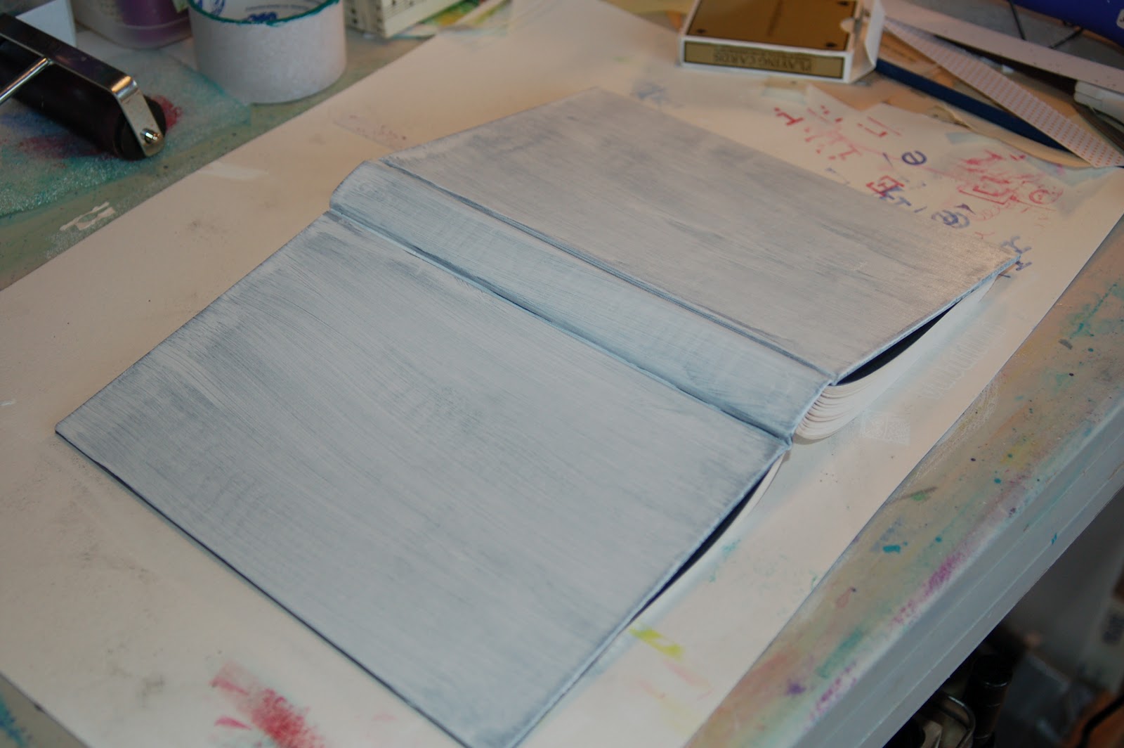
My cover was a solid black so not too hard to do - I sanded it a bit and covered it with a couple coats of gesso. I'm not sure what I'll do to it just yet - it may need more gesso, depending....
Step 2:
I had some of this gorgeous textured handmade paper (no I didn't make it) left over from another project so added it for my inside cover. Yep, that's the glue showing through. Again, when I figure out how to embellish this, I'll be covering up most of those glue marks.
I love the ragged deckle edge.
Step 3 - create niche:
Gluing the back pages together - twice! These clips were the perfect clamp but that's partly because my niche is so thin - will likely do it deeper next time.
Niche cut and glued and drying.
Niche covered with scrapbook paper (corners a little messy) and you can see how thin this niche is. I'm using wire wrapped sea glass to fill it. The left hand page has a cutout corresponding to the size of the nice and there's a blank page on the other side so I'm thinking I'll write some pithy comment there when I get to that. I had this scrapbook paper that felt like seaside/ocean etc to go with the seaglass detail. I'm sure I'll add to the seaglass page....just not sure what yet.
The niche pages are glued to the back cover. Things to do better next time: choose the niche piece first so I make a space deep enough, take more care in cutting/folding the corners of the cover sheet!
Thanks for the detailed instructions Elizabeth! I'm looking forward to the next steps.
There were 3 main components of lesson 3 - prep the cover, reinforce and decorate the inside cover and create a niche at the back.
My cover was a solid black so not too hard to do - I sanded it a bit and covered it with a couple coats of gesso. I'm not sure what I'll do to it just yet - it may need more gesso, depending....
Step 2:
I had some of this gorgeous textured handmade paper (no I didn't make it) left over from another project so added it for my inside cover. Yep, that's the glue showing through. Again, when I figure out how to embellish this, I'll be covering up most of those glue marks.
I love the ragged deckle edge.
Step 3 - create niche:
Gluing the back pages together - twice! These clips were the perfect clamp but that's partly because my niche is so thin - will likely do it deeper next time.
Niche cut and glued and drying.
Niche covered with scrapbook paper (corners a little messy) and you can see how thin this niche is. I'm using wire wrapped sea glass to fill it. The left hand page has a cutout corresponding to the size of the nice and there's a blank page on the other side so I'm thinking I'll write some pithy comment there when I get to that. I had this scrapbook paper that felt like seaside/ocean etc to go with the seaglass detail. I'm sure I'll add to the seaglass page....just not sure what yet.
The niche pages are glued to the back cover. Things to do better next time: choose the niche piece first so I make a space deep enough, take more care in cutting/folding the corners of the cover sheet!
Thanks for the detailed instructions Elizabeth! I'm looking forward to the next steps.
scavenger hunt
I'm getting this posted a little late so there will probably be 100 links ahead of me....but this week had some fun themes. As a reminder, Ashley posts 5 theme topics each Sunday and you have all week to take the pictures and post them the following Sunday.
Vintage:
I did a "vintage" collage of my parents before they got married that I submitted for the IA challenge yesterday, so today I just pulled up one of me with them (vintage is anything over 40 years old and this picture is definitely over that!). No ruffles for me these days, but it was pretty cute then :)
Word or Quote:
A vignette in my house - one of my fave quotes of all time!
Nature's Own:
Mother nature is sure confused the last few days here in the NW (I guess pretty much everywhere - 80 in Chicago in March, really?!) and we had snow on the daffodils! In the middle of March!
People:
You'll have to forgive me if I've shared this one before, but these are my 3 favorite people and it's hard to get them together for a challenge photo, so had to run to the archives for this one!
Photographer's Choice:
Oh my, what do I put here?
In between snow flurries this week I did manage to get over to my favorite little hidden gem of a garden and see what's starting to sprout. Not much yet, but I do love the contrast of this red plant growing out of this old stump.
Enjoy the images from others at Ashley Sisk's site.
Vintage:
I did a "vintage" collage of my parents before they got married that I submitted for the IA challenge yesterday, so today I just pulled up one of me with them (vintage is anything over 40 years old and this picture is definitely over that!). No ruffles for me these days, but it was pretty cute then :)
Word or Quote:
A vignette in my house - one of my fave quotes of all time!
Nature's Own:
Mother nature is sure confused the last few days here in the NW (I guess pretty much everywhere - 80 in Chicago in March, really?!) and we had snow on the daffodils! In the middle of March!
People:
You'll have to forgive me if I've shared this one before, but these are my 3 favorite people and it's hard to get them together for a challenge photo, so had to run to the archives for this one!
Photographer's Choice:
Oh my, what do I put here?
In between snow flurries this week I did manage to get over to my favorite little hidden gem of a garden and see what's starting to sprout. Not much yet, but I do love the contrast of this red plant growing out of this old stump.
Enjoy the images from others at Ashley Sisk's site.
3/16/12
inspiration avenue: vintage photo
Vintage photography is the theme for this week's Inspiration Avenue challenge. I don't own any vintage cameras and certainly can't draw/paint one, so I took the path of using a couple of photos I have of my parents before they were married. I made a simple mini-collage, used some PSE actions, framed it and have something I really like. I wish they were still alive to see and enjoy it.
3/14/12
zentangle: spiral paradox
I love paradox though it usually takes me a while to find my rhythm with it. But I've never used a spiral string and this very angular tangle didn't seem to want to fill the string easily. None-the-less, I managed to find a way. The first one is very literal and without much fanfare or interest. The second one was a little braver and more interesting I think (looks like tumbling paradoxes).
Visit Laura at I am the Diva to see more variations of this theme.
3/13/12
woyww #145
Okay, no it's not my 145th time to participate, but it is the 145th edition of What's on Your Workdesk Wednesday hosted by Julia at Stamping Ground. It appears everyone identifies it by this number, not the number of times they've participated, so I'll join the crowd (it's my 10th time).
This week has been fairly busy creatively: I've completed the zentangle challenge, a couple of digital art challenges, worked in my art journal more than usual and am muddling through a new collage (or two). Oh yeah, I've finished the next stage on my first altered book.
My work table:
Here are my most recent journal pages and the diamond stencil is the first I've cut for myself using my new tool. To the right of the journal is that purplish green square....it's a piece of that rubberized shelf liner for the kitchen that has an interesting texture when paint is spritzed on it (I used it on these journal pages on the upper right in between the pink streaks and on the lower left on the diamonds). Also, remember my little soap box "canvas" that was covered in music sheets? There it is at the top of the pic with the next layer added....
This is the same busy desk showing my progress on my altered book and the niche all glued together. (free lessons provided by Elizabeth at Altered Book Lover, join in!)
I'm off so see what other busy folks are up to....
This week has been fairly busy creatively: I've completed the zentangle challenge, a couple of digital art challenges, worked in my art journal more than usual and am muddling through a new collage (or two). Oh yeah, I've finished the next stage on my first altered book.
My work table:
Here are my most recent journal pages and the diamond stencil is the first I've cut for myself using my new tool. To the right of the journal is that purplish green square....it's a piece of that rubberized shelf liner for the kitchen that has an interesting texture when paint is spritzed on it (I used it on these journal pages on the upper right in between the pink streaks and on the lower left on the diamonds). Also, remember my little soap box "canvas" that was covered in music sheets? There it is at the top of the pic with the next layer added....
This is the same busy desk showing my progress on my altered book and the niche all glued together. (free lessons provided by Elizabeth at Altered Book Lover, join in!)
I'm off so see what other busy folks are up to....
texture tuesday
I can't believe it's Tuesday already and I forgot to work on my digital Texture Tuesday images. Since I am up SO early this morning but in the interest of limited time, I got busy and have an experiment for you. I took the same image and added adjustments and textures from Nancy Donaldson and then redid it using textures from Kim Klassen - both of whom sponsor Texture Tuesday roundups. Which do you prefer, or, like my husband, do you prefer the original?
Original image:
Nancy Donaldson texture encaustic circles at vivid light 35% and a new one from her friend Marie, venetian (the letters) soft light 86%.
This one uses two Kim textures: pourvous (text) at hard light 40% and autumn burst at soft light 55%.
And just for chuckles, here's the image with all 4 textures activated......a bit overdone, but interesting.
Visit Kim and Nancy's sites to see more.....
Original image:
Nancy Donaldson texture encaustic circles at vivid light 35% and a new one from her friend Marie, venetian (the letters) soft light 86%.
This one uses two Kim textures: pourvous (text) at hard light 40% and autumn burst at soft light 55%.
And just for chuckles, here's the image with all 4 textures activated......a bit overdone, but interesting.
Visit Kim and Nancy's sites to see more.....
3/10/12
inspiration ave: mail
I haven't participated at Inspiration Avenue in awhile but as I saw some of the entries being finished for this week's mail challenge, I put my thinking cap on. I had several ideas: picture of postcards I've received from blogging friends, postcards I've made, decorate an envelope artfully, draw a mailbox .....aha! a mailbox.....
That reminded me of a photo I took on vacation last year when we visited the little town where Dan's folks lived for many years, Rockfield, IN. It's a little farming community of a couple hundred people and I took a picture of their post office, on main street - one of about 3 businesses still functioning in town.
I desaturated the image, added PSE filters and frames (thanks for the info Michelle) and a Shadowhouse texture to make my piece of digital art.
One of the best things about Inspiration Ave is how each week so many different interpretations and styles and medium are represented .... I really like all the creativity that shows up at these challenges.
That reminded me of a photo I took on vacation last year when we visited the little town where Dan's folks lived for many years, Rockfield, IN. It's a little farming community of a couple hundred people and I took a picture of their post office, on main street - one of about 3 businesses still functioning in town.
I desaturated the image, added PSE filters and frames (thanks for the info Michelle) and a Shadowhouse texture to make my piece of digital art.
One of the best things about Inspiration Ave is how each week so many different interpretations and styles and medium are represented .... I really like all the creativity that shows up at these challenges.
3/9/12
alaw -3
I finished up my 4 letters for March (actually early for a change) for the A Letter A Week project.
As a reminder for those just finding me and this project, the 'rules' are to make the equivalent of a letter a week - drawn, painted, stitched, beaded, carved....whatever medium you choose - on a surface that's no bigger than 3" square and then to be mounted, framed, booked, displayed in some way. At the end of the year I'll have two completed alphabets. One of the two alphas should have a "spotty" theme and thus the splatters of watercolor paint on my drawings. I've drawn the alphabet, kind of adapted from some font on my computer, then tangled away......hoping the letters don't get lost in the designs. The black ribbon will wander through all the squares, tying them together even more. Watch the progress of everyone over at the website...
zentangle: golven
The Diva challenge #61 by Laura this week was to use Golven, the tangle designed by Mariet.
My two efforts: Top one uses golven, ennies, apiary, jetties and coil while the bottom uses golven, shattuck and a couple no-name (arches and the dandelion type flowers).
Subscribe to:
Posts (Atom)