Showing posts with label lettering art. Show all posts

3/27/14

week 13 for 365-2 (part 1)

March 24 - 30 - A new week, a new batch of projects for my second year of 365......

#83 - playing in my journal and experimenting with a web-like design over a brayer clean off page.

#84 - turned the webby idea into some mail art - I like the boxes background idea so started a series of those....... boxes drawn & shaded with inktense pencils then smooshed blended with a water brush.


#85 - a couple of my "maps" postcards for MMSA this week.  Want to join in? Postmark to Karen by 3/31.

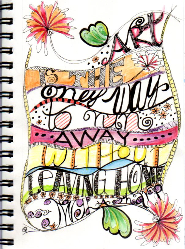
#86 - wanted something quick and easy to fill in this week so thought of lettering.  Well it was kinda easy but not so quick.....it took all evening and I didn't even add color. Sheesh.  And it's not particularly original...I have to move beyond this curvy line style even though I kinda like it - next quote will be something different.

Go make some 'happy accidents' this week......


5/9/12

alaw for may

A Letter A Week - I love this challenge because it's low pressure, I see progress over time and I'm liking how my alpha is looking.  If you like playing with type styles or lettering or collage/paint/stitches, you should consider joining in....by the end of the year we'll have two alphabets artistically created.  See the ALAW site for more details.  Here is the continuation of my 'dotty' alphabet - letters for May.....


3/4/12

lettering love journal - four pages

Here are the first 4 pages of my lettering love journal - I showed the background pages a week or two ago and have been working on them kind of randomly.  As with most things, I'm finding some pages are more successful than others and I still need practice judging how much space the words are going to take.  Since this is only volume 1, I'll have plenty more opportunities to practice!

The cover - simple and easy.


Inside cover, bright and I chose words to set the tone for the rest of the pages.  As suggested by Joanne I used decorative duck tape to bind the pages - it's the black/white on the right.


Pages 2 and 3 are narrower.....

Oooops - crooked tape below....

And page 4, facing the 'joy' page, is back to the standard width.

Here's an example where I started the letters too big necessitating a crunch adjustment at the end, making the word (reward) hard to read.  Bummer.  I actually liked the way 'reward' was going til it got all crowded!

I'll be back with more pages when they're done - maybe end of the week?

2/26/12

lettering love: journal

Lesson 24 of Joanne's lettering love online class was to make a bunch of backgrounds and bind them with duck tape (or washi or whatever tape available) into a journal.   I've been working on these the last few days to the exclusion of all my other projects and decided to share my background pages with you before I start the lettering.

I used a wide range of art supplies & techniques:  acrylic paint, watercolor pencils, oil pastels, stencils, stamps; paint spreading with a credit card, a brush, my fingers, spritzing and splattering.

Front cover:
I was lucky to find this patterned duck tape in a color palette that blends with colors I like to use.  I decided to use a recurring theme of stamped butterfly-ish critters throughout.....

Pages 1,2 (2 is smaller than the rest of the pages)


You can see the edge of page 1 peeking in at the edge....

Pages 7 & 8 - I made them side by side with a big 12" clock stencil as the first layer.  The black & white is another duck tape pattern.


Smooshy finger painting, some brush dancing on the right, stenciling and a small blue butterfly stamp along with mixed use of my duck tapes.

Wanted to have something dark to try my white lettering pens on....not my fave patterns, but maybe the addition of lettering and details will liven them up.

Like these colors MUCH better.

Finally, the back cover.

So, as I finish the lettering on each page, I'll share my progress....  One of my goals this year is to add some pizzazz to my handwriting.  I think I have neat, tidy printing but it's unremarkable and I want to be able to be more artsy about writing when the occasion calls for it.  This class is NOT a calligraphy or class for making formal, structured letters, but more about free flowing, creative, spontaneous alphabets.  I'm having so much fun with it.  AND I like that it combines my enjoyment of making layered, textured pages with lettering.  What could be better?

2/17/12

lettering class practice

Still working on my Lettering Love class with Joanne Sharpe.  Another thing that requires practice, practice, practice.  You see, I'm thinkin' this.  I have opened many avenues so far this year that really stretch me:  ALAW (create a letter a week), Lettering Love to develop create lettering techniques, BOD (book of days art journaling), whimsical drawing from my 52 Lab book, PAF and Texture Tuesday for photo texture play, as well as continuing with zentangles and collage efforts started last year.

I'm a novice at every one of these endeavors.  BUT, the advantage of trying so many things (in my eyes) is that if I get bored with lettering or frustrated with my progress, I can switch to art journaling or zentangles.  I love that I have options.  It may take me longer to get proficient at any of the methods, but that's okay.....it's more fun along the way.  Plus, you guys won't get tired of seeing me post the same things over and over. Right? :)

So here are my recent lettering practice runs.....

 
From lesson 5, drawing wavy lines, filling from top to bottom with lettering and painting in (I used my watercolor pencils & water pen).

This is my first attempt from lesson 11, abstracted - working from my name (do you see it hidden in there?). I kinda like this process so will try it again with a little more of a plan next time. Seems like it would lend itself to zentangle principles.........

2/8/12

lettering class

OMG - as if I didn't have enough irons in the fire, I signed up for Joanne Sharpe's Lettering Love class!  You might have seen some of her style in various Somerset magazines - it's loose and playful and perfect for journaling fun.  The class is really fun and filled with a supportive, inventive group, but she offers an instructional video and homework every day!  Luckily the class will be open indefinitely because I don't think I can keep up the daily pace, but it sure is FUN!

Here's my first couple of projects using her guidelines.

This is the first effort using her suggested words and format.  I used watercolor pencils and my waterbrush to soften them and micron and pitt pens.  I ran into a few spacing issues in my second effort....


This time I picked a quote I like and illustrated it.  The last line is almost impossible to read; it says Twyla Tharp, author of the quote.  You can check out the work of other class participants on flickr.  There's some amazing creativity out there.