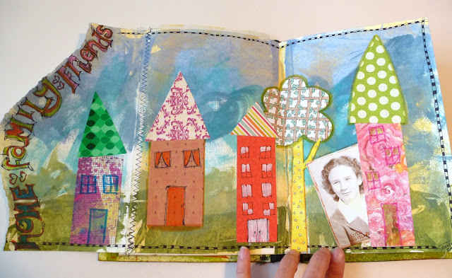
We're each doing two 2-page spreads in each journal.....here are my first couple of spreads. Leslie's theme is "art", how ever and what ever moves you. I know she enjoys vintage images so I used that as my jumping off point for both layouts.
We agreed we could share the journals online since they ALWAYS look so much better in person (and I'm sure I'll totally forget what people have done by the time I actually get my journal back!). (Leslie, if you want to be surprised, stop reading here!)
Leslie made her own journal and used what feels like a heavy weight watercolor paper. I like how she torn the edges of some of the pages and stitched flaps on others, making lots of interesting places to add art. The 'vintage' pic is of my mom at about 18. I used acrylic paints, gelli & scrapbook papers, pen & markers.
The second spread has a much calmer, more vintage feeling.....I've used lace, old papers, new papers, feather, ribbon, a quote (under the bird tag flap), etc. This image is of my great great grandparents. Definitely vintage!
So, I'm eagerly awaiting for the next journal to arrive and see how my creativity will be stretched for that theme!


Your posts are so inspiring :)
ReplyDeleteThank you, Your blogging sister, Connie :)
Looks like a lot of fun and really getting your creative juices flowing!
ReplyDeleteStay inspired!
Fantastic spreads Terrie, tons of texture and lots of fun. So good to hear you are enjoying yourself, it is sooooooo worth it.
ReplyDeleteHuge hugs x
Cute journal pages! I love your little houses! They look like in a fairy tale.
ReplyDeleteNice work and what a fun project to particpate in...does make you nervous about the idea of "wrecking" it doesn't it. Did for me. xox
ReplyDeleteAh, I love them both! Houses as a theme always works for me, and I love the great big words going up the torn edge. I wondered how people would use those.
ReplyDeleteThe second one is really wonderful - the feather, bird, old paper, corrugated, vintage pic - all right up there on my list of faves. Outstanding job, Terrie!
What a wonderful journal to work in. I love the idea of the town edges on some of the pages. And your two spreads are perfect for a vintage look.
ReplyDeletelovely pages, Terrie. this is such a fun project to watch since I "know" so many of you!
ReplyDeleteI love your spreads Terrie! They're so delightfully different but equally beautiful! The extra tidbits on the vintage page, such as the feather and photo of your great, great grandparents are so special xx
ReplyDelete