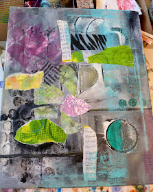
It started like this .... I wanted to try a cruciform composition so started all over....
Collaged some new color and text in place kind of outlining where the cruciform shape might be.
Beginning to define the areas.....
Revised and decided I wanted an angled shape instead of so rigidly cross-like and I wasn't loving the colors.....
It hung this way for awhile but I started to feel like it was incomplete, so........ let's flip it upside down, add more layers, change up the colors a bit.....
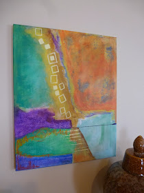
The current permutation hanging....still not loving it but it takes me awhile to figure out what I don't like. I like the shapes okay and I love the layering the the large orange corner (see detail below) but somehow I feel like it's too big a void and something else should be happening there. I'm not loving the purple in the middle and think that may need to go to a warm color to balance the orange.....or maybe I just bring out my buddy Ms. Gesso and start again..... :) Input? Suggestions? I value your opinions.


LOL I actually love the very first image - all the dark grays with the bits of turquoise.
ReplyDeleteAs for the piece as it stands now, for me the part that sticks out when I squint at it is the light blue at bottom right. Not sure what it should be, but that's the part I'd tinker with.
However I'm not a painter so my input is worth just what you paid for it - nothing! Looking forward to seeing what you do with it.
i agree, i like the first one......the values are balanced, i like the colours, the shapes & the lines.
ReplyDeletethis is amazing to see its many transformations. I admire your patience and ability to sit with it, and willingness to take it in a totally different direction.
ReplyDeleteI always admire how you just jump in and completely change a piece. Talk about a transformation! It's hard to really tell from here but i feel like the bright purple and blue on the left may need some more depth? cant wait to see where you go next! xx
ReplyDelete